Blockchain Data Visualization using GraphQL and Gephi
Blockchain visualization tools can help users better understand on-chain activity by providing a graphical representation of the data.
Users can easily see how funds are moving between different addresses and can identify patterns or relationships that may take time to be evident from looking at raw data. This can help users understand the flow of funds across different blockchain networks and can be helpful in tracking transactions, identifying suspicious activity, and detecting fraud.
Bitquery’s Coinpath® API
Coinpath® by Bitquery is a set of blockchain money tracing APIs that uses a sophisticated mathematical algorithm to trace the flow of funds between blockchain addresses. The API uses heuristics and machine learning to determine clusters, transaction flow, account balance, and other important information, which makes it an effective tool for tracking money flow and identifying relationships between different blockchain addresses.
For example, you can trace both inbound and outbound transactions from a specific BTC address or Cardano address. The API provides detailed information about the transactions, including the smart contract associated with the transaction, such as the contract type and the currency symbol and name used in the transaction.
Visualizing using the GraphQL IDE
Instead of displaying the data in a raw JSON format, the IDE presents the data in a graphical format such as a Sankey diagram or a graph, making it easier to understand and interpret the information.
The Sankey diagram is a flow diagram that can be used to visualize the flow of funds between different blockchain addresses, showing the volume of money moving between them. The Graph visualization uses icons, values, and arrows that make it easy to understand money flow. This can help users quickly identify patterns, relationships, and anomalies in the data and make it easier to identify suspicious activity or potential fraud. Here’s a sample video showing you how to visualize the Coinpath® flow using the GraphQL IDE: Coinpath
Visualizing using Gephi
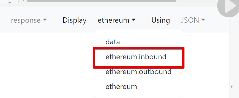
To visualize the data in Gephi, first install Gephi on your system. Exporting the data: Open your GraphQL IDE and run the desired query. Select either “inbound” or “outbound” from the options provided to create a directed graph.
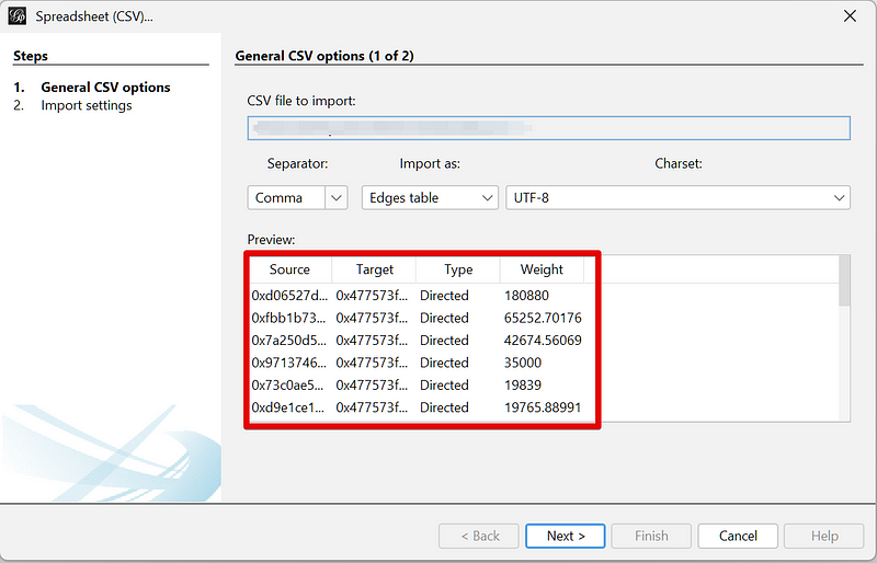
In the data format dropdown, select “Table Widget.”
Follow the video instructions provided for further steps on how to export the data for Gephi visualization: Export
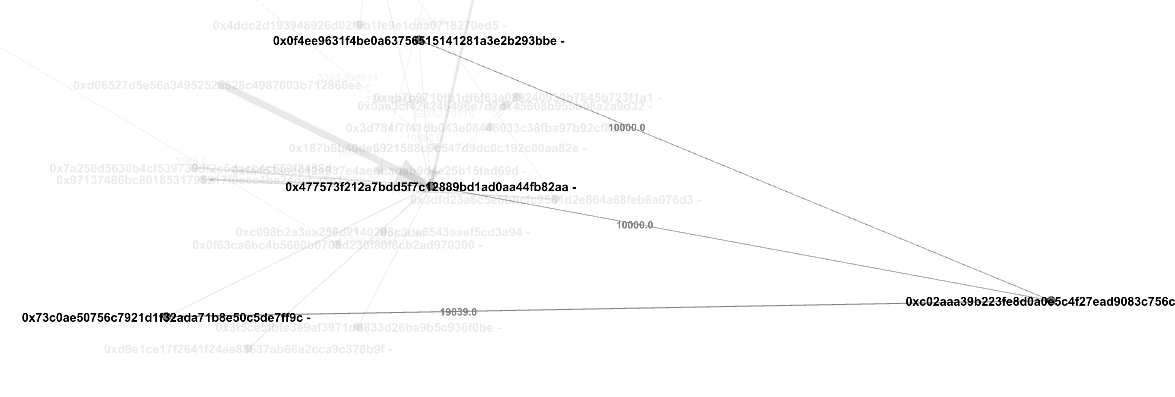
Visualizing the data in Gephi
Once imported, you will see the graph. You can set the graph to display or hide the labels (in this case, the address) and weight (in this case, the amount).
Click on any node to see the inbound transfers. The label on the edge indicates the amount that was sent.
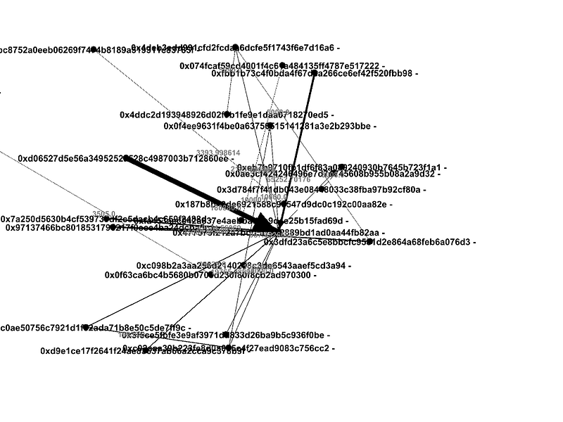
Play around with the visualization to understand token transfers, you can quickly identify patterns and relationships that would have otherwise been difficult to spot.
Bitquery supports 40+ blockchain networks, such as Ethereum, Bitcoin, and Binance Chain. This may be useful for developers who want to build dApps that can query data from multiple blockchains. By using the points system to charge you for what you request, we save you millions of dollars in business costs. Sign up for a developer account for free.
Subscribe to our newsletter
Subscribe and never miss any updates related to our APIs, new developments & latest news etc. Our newsletter is sent once a week on Monday.


